
The word appearance has two meanings: one literally means to appear; the other describes what something looks like. Let’s talk about the first meaning, which is the first thing a writer thinks about: how am I going to get this book to readers?Most writers will have gone through the arduous task of sending work out to agents or, in some cases, directly to publishers. (Though very few publishers, nowadays, will accept manuscripts.) Some writers are successful and get published by the mainstream section of the book industry.
After the rejections, quite a few opt for vanity publishing, which gets its name from the fact that writers—whom publishers reject—are so vane, they get a printer to print their work and they sell it themselves. The one flaw in the term vanityis one’s perception of the abilities of mainstream editors knowing a good book if they fell over one! When you try and read some of the rubbish that gets published, you wonder if a machine read it, or the editor was drunk or affected by some other malady. It goes without saying, there are attics, closets, garages and charity shops, with boxes of unsold, though not always unreadable, books.
Up until fairly recently, mainstream and so-called vanity publishing were the only options open to writers, besides the odd nervous breakdown—until the arrival of the internet. E-books have become a growth industry for the vanity publishing sector, and have opened a whole new dimension to publishing. Admittedly, in some spheres of e-publishing the quality of books, both physical and intellectual leaves a lot to be desired. A parallel of e-publishing is the improvement and use of print-on-demand, which until fairly recently was a bit disorganized, but has come on with leaps and bounds, mainly due to the advances in printing technology and its wider use by the publishing industry and author communities. Vanity publishing was the forerunner of print on demand, but due to print technology advances, digital short run printing has reduced the economic tipping point between laser and offset printing. The cost was cheaper the more copies printed until the arrival of what basically were giant colour photocopiers/computer laser printers. These machines are still enormous, as I happen to know someone who sells them in the UK, and he tells me they are being improved all the time. They cost about £250,000 a go, [ED-recent costs of the EBM can be found here and here with standard and more advanced models available for outright purchase or leasing] and are mostly being bought by universities, health authorities, local governments and in-house print companies. At the push of a button, the machine reads a file, and minutes later, out pops a ready-made paperback, printed by laser with a glue-binding. Laser printing is in fact more expensive than normal printing methods, but its ability to do one-off books is its greatest benefit. Up until this kind of print technology appeared, printing involved lithography or letterpress, and was labour intensive to set up.
Naturally, the mainstream people are not very happy, and old habits die hard. The clever ones will either have the cash to buy one of these machines, or do a deal with the likes of Amazon, and avoid the complicated arrangements in place for mainstream publishing: printers; transport; holding stock inventory, distributors and whatever: ad infinitum. Before I move on, let’s take a look at what that last sentence involves. Printing: most mass-produced paperbacks and a lot of hardbacks, are printed on very nasty paper, little better than thick newsprint. The cost of printing these pulpbooks is peanuts, probably 50cents plus (US). Shipping to the publisher’s distribution channels depends on deals with hauliers and distances, before books reach retailers. The publisher has to pay its editors (though in some cases, one wonders why) and then it has to market the book, not forgetting the original typesetting, cover design, proofing etc.
To get the book on retail bookshelves usually involves a distributor, and they don’t come cheap. Before that, there is the cost of delivering books to them! Most distributors charge about 50% of the retail price, out of which they pay the book sellers their 30 to 35% for selling it. I can see the calculators, abaci, of your minds doing some sums (math in the US) and coming to the horrifying conclusion that the writer is the one who gets the least out of all of this palaver! There are one or two short cuts in the system, but they aren’t a great help: small publishers can sell their books at book fairs, and some of the ISBN agencies will funnel orders from bookshops, but that then involves the small publisher with a bill for postage. A friend of mine, who is a small publisher, told me the other day that Nielsen BookNet had forwarded some orders to him, but the postage costs are horrendous. The likes of Amazon have negotiated deals with the postal companies. Hence you can get a book sent out for little cost. For example: I ordered a book, which was sent out at a total cost of €3, but it was sent to the wrong address. When my friend took it to the post office, she was told it would cost €6 to post to the right address, but to send it back, would cost nothing. I was refunded the €3 when the book arrived back at the senders. I reordered it, and it was sent out for €3 and duly arrived at the right address. Again, I can see your brains trying to get around that one!
The last hurdle in the mainstream system is the displaying of your book in shops, and any of you who browse in bookshops will know how hit and miss that is.
The one big issue in the first meaning of appearanceis how you tell people it has appeared—been published. Publishers use AI’s (Advance Information), ARC’s (Advanced Review Copies), their trade distributor channel, data and catalogue listings, which all go out to buyers at bookshops and they will put adverts in The Bookseller, Publishers Weekly and so on. Vanity publishers have to do the same, and to some extent, so do the e-book publishing services and self-published writers. One advantage for mainstream publishers are that potential readers will find books on the shelves, which is marginally easier than the task facing those publishers and authors relying mainly on internet sellers, because the stocks in bookshops are smaller and quicker to browse. When you see the numbers involved in internet sellers (new books), the mind boggles!
Now we come to the other meaning of the word appearance: what your book looks like. Most people assume this involves just the cover, but there is much more involved: font types and size; paragraph spacing; quality of paper product; and so on.
Let’s start with font type. Printer’s fonts can only be printed, as opposed to what is called “one stroke script”, such as copperplate, straight black letter or cursive: scripts that can be written by hand and were used in the writing of manuscripts, and hand written letters etc. The most famous of printer’s fonts is Roman, and its origins date back to ancient Rome, where it was used for engraving/letter-cutting of public notices. It has serifs and tails, which cannot be done by handwriting, and when it is used in calligraphy, it is referred to as “built lettering”, meaning several strokes are needed to make even one simple letter. Of all printer fonts, it is the most readable, and has withstood the tests of time: there are variations, which are hardly noticeable to the average reader, such as Times New Roman.
What a lot of publishers, mainstream or independent or self-published authors don’t realise is that a significant proportion of the public suffer from poor eyesight and dyslexia, and many read in poor light conditions or other situations, which make reading difficult, such as trains and buses, so it’s important to choose an easy to read font. This brings up the question of italics, which a lot of publishers seem to think is very useful, but unfortunately, over use it. Large blocks of italics are difficult to read for most readers, and I will skip over such large blocks, picking up the odd word here and there, and generally relying on the last few sentences to convey the meaning: if there is any. A lot of italicised script is more often or not an aside or some sort of flashback, and a lot of seasoned readers ignore most of it! So keep the italics short and sweet! The next problem with fonts is using bold typeface in normal text: don’t! I have also come across the bizarre use of italics and a fainter tone of ink. One book had a grey ink, and it was virtually unreadable, unless one got a daylight bulb! Some writers have the annoying habit of capitalising the first word or more of a chapter: don’t, it looks cheesy!
Text blocking is another aspect of appearance, and can be very threatening to a lot of readers. The obvious physical problem that occurs, when one is confronted with a page of continuous print, is being able to keep on the right line, and the next is that of concentration. The fragile readers, dyslexics, etc. cannot read such blocks, and seasoned readers instinctively know that the writer is going onto a pet subject and will start to skip through the text, knowing the writer is not going to stop for breath: they forget that the reader has to stop for breath. If the writer was to stand in front of someone and talk to them, they wouldn’t do so in such a manner: they would stop for breath! The simplest way of breaking a text block is to use first line indents combined with changes in the delivery, which means you have to think about the construction of the text. Another is to cut it down and reconsider the boredom aspect! While on the subject of blocks of text, let’s look at text alignment. In normal writing, personal letters etc., the alignment is to the left of the page, if writing in romance languages. This is fine for dissertations, scientific papers etc., but in books, it is traditional to use justified alignment, which is easier to read. I have come across some e-books with left alignment and they look scrappy, untidy and annoying: you don’t want to annoy your readers!
Having mentioned first line indent, it is advisable to always use that, as again, it makes reading easier: dialogue should be indented as well as paragraphs. The indent means a change of instance or meaning, and without it, the average reader will think there is a typo, if the next sentence starts at the beginning of the line. It causes confusion, and in some cases, a rereading of a line, before the reader realises a new meaning or situation has occurred.
Talking of paragraphs, it is not a good idea to double space between every paragraph: to the seasoned reader, it is annoying. It may be okay for children’s books, but not for general reading. Its main use is when a new event is introduced. For example, if subjects are involved in a journey, it helps to have the double space, if you want to say what happened when they arrived. In a sense, it lets the reader get out of the car—so to speak. It is also used when two events are taking place at the same time, and the next paragraph might start with: Meanwhile, back at the ranch……! A first line indent usually isn’t the best device to use there: the double space is more effective and less confusing for the reader. Use the speaking to someone rule: stop for a longer breath!
Visual appearances aren’t the only aspect of the appearance: there is also the mental aspect. When the reader absorbs the information, the brain needs to know when a change is taking place, so we have inverted commas to indicate speech; we have the simple comma to create lists, and to indicate a contradiction: the most famous is when we use the word but. Question marks, exclamation marks, colons, semi colons, brackets and dashes (hyphens), not forgetting the simple single inverted comma, used to denote the absence of letters or the genitive case (apostrophe), all help to convey meaning to the reader when used correctly.
A pair of inverted commas normally indicates speech. They can also be used to emphasise a word, very often getting tangled up with themselves if they cover the last word of a speech sentence: so you have to reconstruct your sentence. [ED-strongly disagrees with this, as more often than not, it is overused or wrongly used] In some instances, single inverted commas are used for this purpose. Another form of single inverted comma is the apostrophe, which is used in place of the word of when referring to ownership (That is the house of Mr Smith= That is Mr Smith’s house). Its other use is to indicate abbreviated words like, didn’t, can’t, let’s (let us) or that’s. (That’s: could have been used in the “Smith” example just shown). The use of the apostrophe reduces the pedantic nature of writing. It helps the glide-flow of the text.
The comma with the most problems is the simple comma, because it can completely alter the meaning of a sentence if it isn’t in the right place: or missing. Its main purposes are, to divide actions, to cause pauses, but not full stops. The best way to decide where pauses should be is to read the piece out loud, as if you had an audience.
The comma has set rules: to separate verbs; before the word but; in a listing; after a date; sometimes with the word because and sometimes before the word and, if the and is denoting a change of verb. (I came out of the bedroom, tripped over the carpet, and fell down the stairs.) The and vanishes and is replaced by a comma, if another action follows. (I came out of the bedroom, tripped over the carpet, fell down the stairs, and my sister came out of the kitchen, to see what had happened.) Some writers, who don’t know their grammar, will put a row of andstogether, which is really annoying!
If you were telling that to a person, face to face, you wouldn’t have a row of ands, and you would make suitable pauses or gestures, where the commas are. Basically, the reader is reading out loud to themselves, and you must provide the right punctuation.
Speech of different people should have separate lines and be indented. I have noticed that some e-book writers have speech and replies closely following, even on the same line, and often without any punctuation between the two speakers. (“How are you today, Charlie?” “I’m fine, Fred, how are you?”)
One of the most annoying aspects of reading is that of consistency, and the colon and its close relative the semicolon are one of the favourites. The general rule is that if you have addition to a sentence, which can’t stand alone, you use a colon. (Use the speaking to someonerule: stop for a longer breath!) If you wanted to add again to that, you would use a semicolon ( ……..rule: stop for a longer breath; wave your arms.) I have come across mainstream books, which switch from colon to semicolon as the first colon mark. Another consistency problem is that of punctuation within speech. (“He will always be like that.” Said the inspector.) That example is the traditional way: a full stop followed by a capital. Some authors use a comma and lowercase: (“He will always be like that,” said the inspector.) This usage is more common in non-standard English, but if you use one or the other, please stick to it. I have come across books with both usages! (This often is the result of splitting a proof text and giving sections to different proof readers!)
Besides the punctuation aspect and the reader’s mind, there are a couple of grammar rules that need to be observed: don’t start a sentence with but or and, because they are intended to be used within a sentence to either add a point, or contradict a point. (We love listening to music, but not on a Sunday) If you find you have written a butor an and sentence, go back and fix it. The and can probably be simply removed, and just change the full stop for a comma, and lowercase the ‘b’.
One of the main skills of writing is not the story: it is how you tell it. The skill of the writer makes the reader disappear into another world, and glide through without noticing. This is where continuity comes in, and sadly, some books, stories are like a child’s first book: The cat sat on the mat. Dan and Mary sat at the table. The dog wagged his tail. With continuity: The cat sat on the mat, and Dan and Mary sat at the table, while the dog wagged his tale.
Adverbial clauses are also another problem, when it comes to making sense and continuity: At the top of the main street behind the post office next to the parish church I saw a vintage car. If you said that face to face, there is no way you would say it all in one go! So: At the top of the main street, behind the post office, next to the church, I saw a vintage car. While saying that, you would probably use hand gestures, or changes of voice tone.
Since this is supposed to be an essay on writing, and not a book on the subject, it is time to stop, before the reader loses interest!
Vincent Flannery is an author and producer-presenter of the Culture Gap Program, Radio Liberté, France (Every Sunday at 15hrs.(3pm local time) Internet and podcast).
I was brought up in The Vale of Avoca, County Wicklow, Eire, made famous the world over by Thomas Moore the 19th century poet, also author of “the last rose of summer”.
The vale was also made famous by the BBC (UK TV) program “Bally Kissangel” which was made in Avoca, and if you like my book “The Quarreller’s Diary” it will be even more famous!
I was edumacated (!) by the holy Dominicans, originally made famous by the Cathars and the Inquisition. Fortunately, by the time their attention came round to me, their methods of persuasion had changed for the better.
Thinking of how I ended up now, I’m not quite so sure about that!
I suffer from chronic lack of focus, which for some, is an excuse for doing feck all. My problem was that I was doing too many things all at once, so when my writing career could have taken off, I let it be sidelined. I started writing sarcastic stuff for magazines, which took the mickey out of whoever had the nerve to pop their heads over the stockade when I was about to go to press.
That was in 1984 and it was great fun. My second burst of such nonsense was in 1995, and that was even more fun. That was when I started to draw cartoons to accompany my articles.
In 2002 I decided enough time was lost chasing my tail and I wrote the first complete book: HOTEL DE FRANCE, which related how I ended up in France. Hotel de France is now on Kindle as “A Story of Aubeterre”, with over 50 colour pics (best seen on a PC)
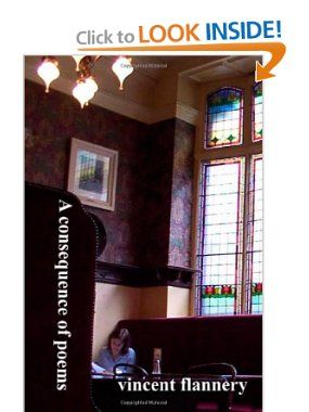
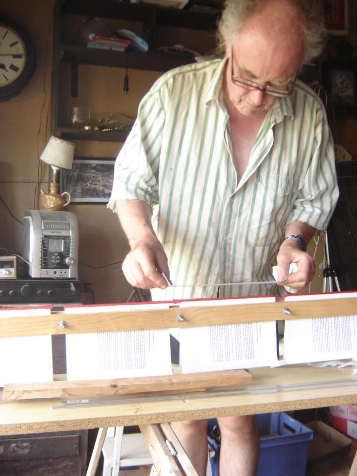
In September 2012 I just put up on Kindle, a book of poetry, which has been sitting around for a long time. A limited edition of handmade books was published, but then it was put on the back burner: more lack of focus!
I now also have an English Language program on French radio www.radioliberte.fr whereI talk more nonsense and some serious stuff: a section on writing and another on Old French House renovations and care. Sundays at 2pm french time, and on podcast.
Enough to keep you going for the moment.